When The Manual, Everywhere started to take shape, we realized we needed a renewed identity to reflect our new multi-format nature. We wanted a mark that befit a modern-day publisher and honored the modern but timeless character of the articles and lessons we publish – a mark that could stand on its own without relying solely on typography.
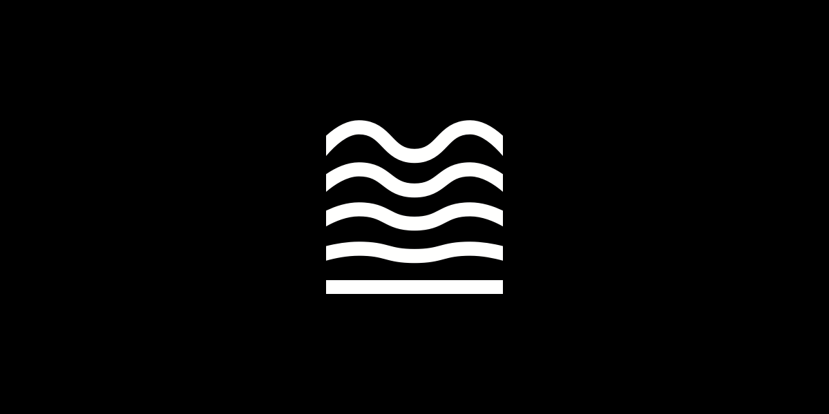
For that, we turned to Brent Couchman, the founder of Moniker, whose simple-looking yet powerful branding work we had admired for a while. When Brent handed in his first round of work, we immediately fell in love with the mark we now use today:

Here’s what Brent had to say about it:
The initial idea came from a line in the Letter from the Publisher for the first issue of The Manual: “It’s clear that a number of us are sensing a shift; we feel the tectonic plates of design realigning.”
This idea of shifting was interesting and applied to the project in multiple ways. First, it tied into the overall theme of The Manual (the ever-shifting internet), as well as the next phase, which included taking the Manual from print to any and every screen.
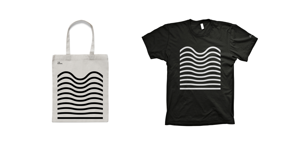
The new logo, as you see it, is just one of the many possible versions it can take. Its ripples can shrink to accommodate a smaller area or expand to fill a larger canvas. We asked Brent to apply the new logo to merchandise for our Kickstarter SUPPORTER reward: a crisp black t-shirt and a smart white canvas tote bag.

Here’s Brent again on the flexibility of the mark:
Rather than using the logo on every item and risking overkill, we built a flexible pattern that could be scaled and expanded to fit at different sizes. For items like totes and t-shirts, it can scale up depending on the size of the object it’s on. It’s a fun way to extend the language of the icon.
We’re elated that our new logo perfectly captures this new phase for The Manual. We’re also excited to continue working with Brent on a special mark for The Fellowship. As we do so, we’ll continue to share progress on Twitter, so follow @themanual to stay in touch.