We plan to work in public here at The Manual, sharing insights from our work, the rationale behind our design decisions, releasing smaller but more frequent updates to our site, and in a larger way, being more transparent and open to our readers.
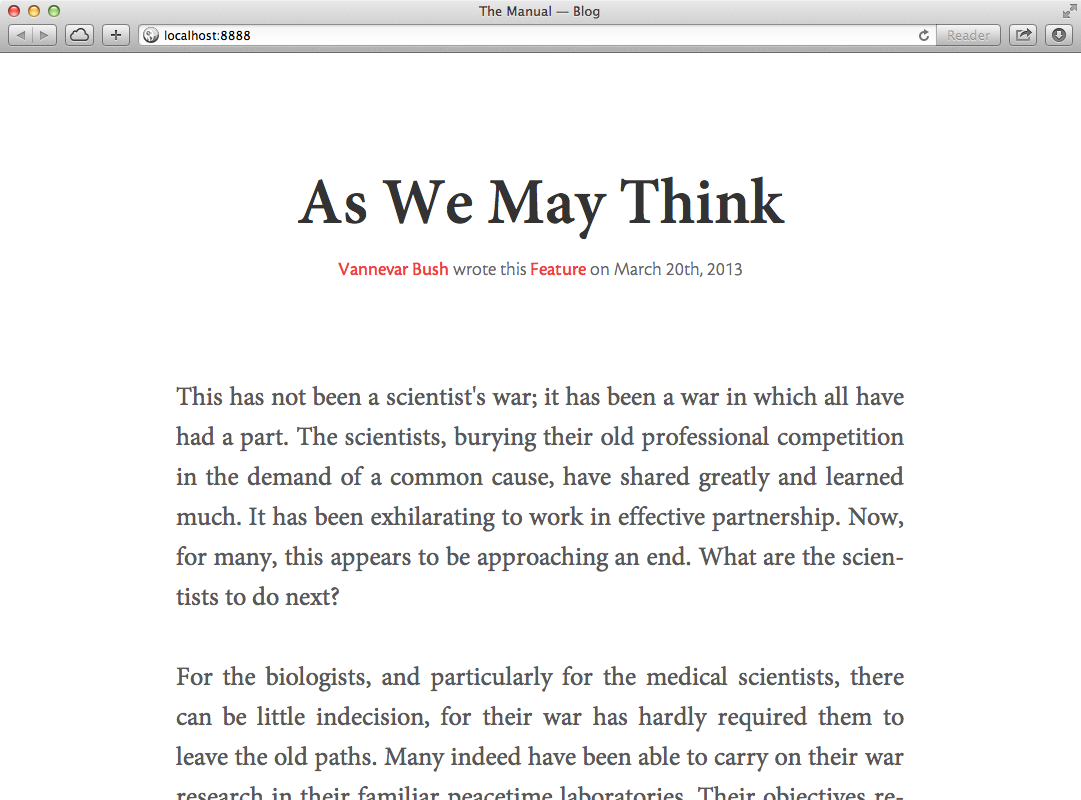
Earlier this week, we released a preview of the work we’ve been doing on our website by publishing “Perennial Design”, an article from our upcoming fourth issue. While the final design will be more complete, this preview already reveals many design decisions, namely in terms of typography.
Typefaces
In the video for The Manual’s Kickstarter project, Andy said:
[The Manual] is a brand new limited-run print magazine, focussing around the maturing of design on the web. Each issue will have six substantial, beautifully illustrated feature articles, written by established and emerging talent, with a focus on bringing a greater depth to the conversation surrounding our profession.
These words still guide us to this day, and we wanted the typography, which plays a major role in the overall design, to reflect the guiding principles of The Manual. Our typefaces should feel like the publication itself: mature but modern, substantial but friendly, deep but unassuming.
I began by picking up from the choices I had made on The Manual, Everywhere teaser page — Cronos Pro and Minion Pro, two beautiful faces from Adobe type designer Robert Slimbach which pair incredibly well. Then, I set an article with them, and let it sit for a while. Typefaces need time. We need to live with them before making up our minds. That means reading with them, and being around them to fully appreciate how they are, feel, and behave. Typefaces have their own ways and little quirks which only reveal themselves after taking time to sink in.
After a period, we still liked how they read — and still do — but it wasn’t until I tried them in a different context that we started to understand that they weren’t exactly right for us.
Changing Context
We moved on to the Issue page, which displays an overview of the issue’s contents. Whereas articles page are dominated by two major elements, issue pages display six neatly organized small blocks, one per author, each containing multiple distinct bits of text: writer’s names, articles and lessons’ titles and corresponding synopses. As such, readers will quickly hop between blocks, scanning small disparate bits of text as their eyes zag across the page in bursts, making sense of all these pieces in a matter of seconds.
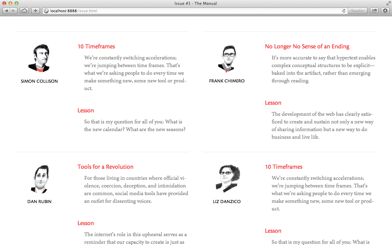
Different content creates different contexts, which require specific ways to set type. Whereas I relied on size and layout for contrast on the article page, here I set the type much smaller, relying mostly on weight and color for contrast between distinctive elements. However, whenever more than a typeface is used, an additional natural contrast comes to play — the inherent differences between each face’s typeforms — and that’s where we began to notice a few shortcomings.
When set in small sizes, the likeness of both typefaces’ humanist forms becomes apparent, decreasing contrast. Relying too much on weight and color in a context with so many diverse elements could result in a cacophonous design, and I wanted to retain enough contrast between the typefaces even and similar sizes and weights. Pairing distinct styles, such as a grotesque sans and a humanist serif, should improve it. Additionally, at a smaller size Minion’s low x-height becomes obvious, harming legibility, which calls for a body typeface with a taller x-height.
So I went hunting for typefaces that fit our particular needs. For the serif, we picked Freight Text Pro designed by Joshua Darden, with a tall x-height, an useful myriad of weights, and beautiful italics to boot. For the sans, we went with Franklin Gothic, Morris Fuller Benton’s classic grotesque, which contrasts nicely with our serif, renders well at both large and small sizes, and also features a rich variety of weights1.
Besides working well in multiple contexts, we feel that these typefaces reflect how The Manual wants to feel: mature, deep, and substantial, but also modern, friendly, and unassuming.
Typesetting
The bulk of an article is its body, taking over 90% of its length. However, it proved to be a fairly straightforward design problem, due to the articles’ very simple nature: a sequence of ordinary paragraphs, with occasional subheadings or quotations — but nothing else — arranged consecutively and without anything on either side.
That’s not to say there weren’t any constraints or interesting problems. Common typesetting details such as initials or opening paragraphs in a larger size were constrained by authors often starting their articles with quotations. On the other hand, authors also create an interesting problem with their use of footnotes, which in their current incarnation still dramatically disrupt the reading flow, a problem we’re still working on.
However, the two most curious decisions have to do with seemingly ordinary paragraphs, and arose late in the process.
Hyphenation
When I first imported the previous issues’ articles and lessons — all of which I had previously read in print — on to the site, it occurred to me that I should try hyphenating the text2. It looked good, but looking good wasn’t enough to form a solid opinion, so I read some passages but still couldn’t detect any major faults with hyphenation, and it stayed on.
Hyphenation didn’t make the cut, but it wasn’t until I first set “Perennial Design” — which I hadn’t read before — and decided to read it in full on the browser that I my opinion reversed. As I was reading the article, it became increasingly obvious that hyphenation had less than optimal results, and it was distracting and disrupting my reading. As it turns out, I hadn’t really read on the browser before — I thought I had, but reading a few passages is just not the same. Some problems are only caught and some judgments can only be made by being meticulous and thorough in observing the work, leaving no stone unturned. When setting type, there’s no substitute for reading.
Indentation
Hours before we launched, I decided to question a decision made long ago. Earlier in the process, as I was setting articles and lessons side by side, spacing consecutive paragraphs seemed like an obvious choice. Unlike articles, lessons don’t usually have subheadings or quotations, and indenting paragraphs would create an impenetrable block of uninterrupted text3.
However, as we were launching “Perennial Design” on its own, without a companion lesson, indented paragraphs had no reason not to be an viable choice, so I took some precious pre-launch time to see how they looked, and was surprisingly glad with the result. Not only it suits The Manual more,4 evoking a more substantial feeling, as it also groups consecutive paragraphs nicely under a common subheading, until the appearance of a new one imposes a break in the rhythm.
The rationale for spacing paragraphs was one of consistency, but different kinds of pieces have their own particular constraints. Finding a proper solution for each specific set of problems, however related, is a better option than attempting at a one-size-fits-all decision for the sake of consistency5.
Observations
A few insights emerged from this long process — nothing other people haven’t written about before, but that somehow became truer as they were revealed to me through my own work.
Typefaces are much like people. They have a personality of their own, and all the little quirks and intricacies that come along with it. They can’t be fully appreciated on the surface, and we don’t really know them until we live with them for a while and watch them in many different contexts.
There’s no substitute for real content. Each subject matter has its intrinsic constraints, so the more final our content is when we design, the less time we risk wasting by coming up with solutions for a set of problems that isn’t exactly ours.
Reading is the fundamental test. Even if content final and type looks great, it’s not until we read that we know if it actually works. Don’t shortcut it — some problems need time and patience before revealing themselves.
Writing about this process was immensely enlightening, and we plan to keep doing as we go, hoping it’s as useful to our readers as it is to us.
It’s time to get back to work. Until next time.
-
You may notice that all of our choices were available in Typekit, and that was a conscious choice. By using typefaces from a one single provider, we’re making less HTTP requests when loading the page, reducing the number of points of failure, and improving the project’s maintainability. ↩
-
But I kept the text ragged right, not justified ↩
-
If you’re unfamiliar with The Manual, each issue features six authors, each contributing one article and one lesson (smaller and more personal than articles). ↩
-
This is a paraphrasing of Robin’s, whose feedback on this matter was very helpful and much appreciated. ↩
-
Futhermore, lessons already naturally different from articles, as they don’t have an illustration, which required a different header design. ↩